Why Your AI Anime Art Looks Wrong: 9 Common Problems and Exact Fixes
You know the feeling: the generation finishes, and something is just… off. This troubleshooting guide diagnoses the nine most common failure modes in Ghibli-style AI art and gives you the exact fix for each.
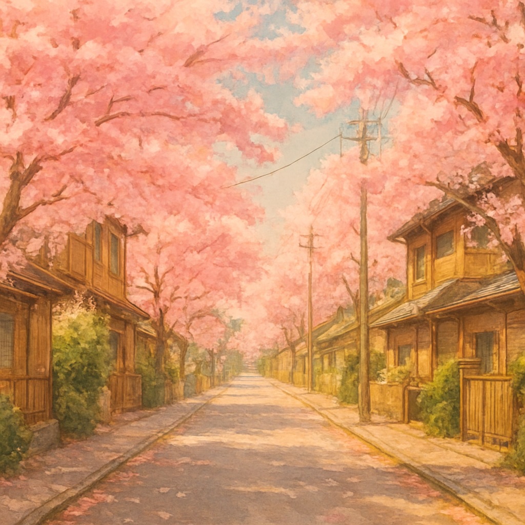
Every AI artist knows the disappointment of a generation that's technically fine but aesthetically wrong — too glossy, too modern, weirdly composed, or missing the warmth you were picturing. The good news: these failures are not random. They fall into predictable patterns with known causes and reliable fixes. Bookmark this guide and diagnose your next disappointing generation against it.
Problem 1: It Looks Like a Photo With a Filter
Cause: the model wasn't pushed hard enough away from its photographic training bias. A weak style instruction ('make it anime') gets a weak style shift. Fix: stack medium keywords — 'hand-painted watercolor background, visible brushstrokes, cel animation style, traditional painted animation, soft pigment textures.' The more medium-specific language, the further from photography the output moves.
Problem 2: It Looks Like Modern Anime, Not Classic Ghibli
Cause: 'anime' as a keyword is dominated by contemporary digital anime in training data — sharp cel shading, saturated colors, glossy highlights. Fix: specify the era and technique instead of the genre: '1990s hand-painted animation film still, gouache background, muted nostalgic palette, analog film grain.' Add a suppressor: avoid or negate 'modern anime style, sharp cel shading, neon colors.'
Problem 3: Faces Come Out Distorted
Cause: faces occupy few pixels relative to their perceptual importance, and photo transformations must reconcile real facial geometry with stylization. Fix: crop the source photo so the face is larger in frame; add 'preserve facial features and expression, natural proportions, gentle detailed face.' If a group photo keeps failing, transform individuals separately — face fidelity drops with each additional person in frame.
Problem 4: Colors Are Radioactive
Cause: models over-saturate by default because saturation wins engagement in training feedback. The painted-animation palette is actually quite restrained. Fix: 'muted earth-tone palette, soft desaturated background, restrained saturation, harmonious analogous colors, watercolor softness.' If one color dominates (usually teal or magenta), name its replacement explicitly: 'warm amber and sage green palette.'
Problem 5: Lighting Is Flat and Lifeless
Cause: no lighting instruction means the model averages all lighting conditions into directionless ambient light. Fix: every prompt needs exactly one dominant light source: 'low golden-hour sun casting long shadows,' 'single warm lantern in blue dusk,' 'bright overcast sky with soft shadows.' One light source, stated once, transforms depth instantly.
Problem 6: The Composition Is Cluttered
Cause: prompt listing too many co-equal elements — the model tries to honor all of them at equal visual weight. Fix: pick one subject and demote everything else to environment: 'a girl reading under a tree (subject), distant village and passing clouds (environment).' Add 'clear focal point, simple composition, generous negative space, rule of thirds.'
Problem 7: Garbled Text and Watermark Ghosts
Cause: the model reproduces text-like artifacts from training data — signage, signatures, watermark-like shapes. Fix: negate them: 'no text, no signature, no watermark, no lettering.' If you want signage in the scene (a shop front), accept it will be decorative squiggles and keep it small, or add real text later in an editor.
Problem 8: Results Are Wildly Inconsistent Between Generations
Cause: short prompts leave the model enormous interpretive freedom, so each roll of the dice lands differently. Fix: longer, more specific prompts constrain the possibility space — specify medium, palette, lighting, era, and composition every time, using a saved template. Professional workflows treat the prompt as a locked 'style bible' and vary only the subject line between generations.
Problem 9: It's Pretty, But It Has No Soul
The subtlest failure: technically competent, emotionally empty. Cause: no narrative or atmosphere cue — the model painted a place, not a moment. Fix: add one story detail and one atmospheric verb: 'laundry drying in the sea breeze,' 'steam rising from a teacup on the windowsill,' 'a bicycle leaning against the gate, its basket full of bread.' Implied life is the actual secret of this aesthetic — the sense that someone lives in the frame and just stepped away.
The Universal Debug Sequence
- 1.Generate with your current prompt and identify which problem above best matches the failure
- 2.Apply only that one fix and regenerate — changing five things at once teaches you nothing
- 3.Once the biggest problem is fixed, move to the next most visible issue
- 4.When a prompt finally sings, save it verbatim — it's now a reusable template